


It's not that they turn into Taylor Lautner in the day time. Not a 'bad' problem to have...half the time anyway.
Werewolves are great because they are one part human, and one part unfiltered feral maniac. The commonality? Both are capable of creating and being the subject of culture's collective conscience, our stories and myths...and they also live among us. Look like us. Talk like us. And tell stories like us.
Howler is my werewolf. A carrier of branding design works that are genetically and inherently relatable strategic, intentional and highly considered that also possess an innate ability to conjure a sense of cultural infatuation, folkloric supposition and a desire to be associated with the beast (see: brand) itself.
Especially if bears any similar qualities to a certain Hollywood werewolf.


Chicago Interactive Marketing Association (CIMA)
CIMA's primary objectives are to connect current digital marketing and advertising professionals in Chicago as well as provide mentorship opportunities to recent college graduates and serve as their advocate in helping get their foot across the industry's threshold.
From 2021-2023, I served as a board member, the brand's Creative Director, the sole content creator and a mentor in the brand's college graduate mentorship program. But before any of this, I earned the board's trust by rebranding them from the ground up, starting with a new logo and brand identity system.

The pixel is both the genesis and the foundation of all digital marketing. And CIMA is the genesis and foundation of digital marketing careers and productive industry relationships. This principal idea along with the organization's intent to be more inclusive and equitable to all Chicagoans in digital marketing and the city itself were the driving forces behind the final logo design and brand look and feel. And even a few that didn't survive the design gallows.


The base shape of the mark started with the idea of a 3D pixel and gradually evolved into a more contemporarily styled mark as I started integrating colors, lines and shapes found in the city's architectural and landmark design.
These marks fell out of the overarching concept.


After revisions that fell out of discussions with the board, the final mark design took shape.


A semi-transparent 'C' that represents a dimensional pixel with depth of field,
structure and intentionally rounded edges.
DESIGN DECISIONS
COLOR:
Two colors that shift and gradate into one another. Purple and blue. Purple to represent the organization's values of equity and inclusion (i.e.: a combination of red and blue found in the city flag) and a blue that feels inherently digital and native to 'Chicago'. The blue is informed by sources of electricity seen around the city at night.
FORM:
The overall form integrates semitransparent elements with opaque to communicate the organization's value of openness and transparency. Together, they create a negative space in the center that echoes the concept of a rounded pixel. It also, by proxy of being a C shape has a natural negative shape in the center. The shape created by the negative space echoes the overall silhouette/concept of the mark. I felt like that did a nice job of tying together the digital aspect of the organization and the organization's values. An organization and safe space for all digital marketing professionals in Chicago.


The look and feel were informed by the neon and LED lighting coursing and vibrating throughout the city and inspired by the energy of the diverse group of people who work in Chicago's digital marketing industry and digital design elements like website UI design, UX frameworks, banner shapes and proportions and buttons/elements and pixels.
PHOTOGRAPHY:

I hired LA based photographer Frank Ishman to bring the brand vibe and vision to life through a series of portraits of our board members. Which he did perfectly.


SOCIAL:


WEBSITE RE-DESIGN:


DIGITAL:





WBEZ Chicago
If you're a regular NPR listener, you've likely caught one or fifteen "Wait Wait...Don't Tell Me!" episodes. If you're from or have lived in Chicago, you know NPR's WBEZ Chicago are responsible for producing the show. And for those who also listen to WBEZ regularly, they know they can rely on the station for timely news reported with integrity, dependability, inclusivity and factual, thoroughly vetted sources without an err of unlistenable banality, but instead with news-appropriate and measured charisma. To put it simply, they'll give you the whole story without an agenda in a style that keeps you engaged without sacrificing relevance or credibility.


With that said, their branding unfortunately does not tell this story. It lacks a point of view or voice. It also sells the quality, relevance and value of the journalism, reporting and programming short.
When I put my mind to creating a more appropriate identity system for the station, I focused on bringing out WBEZ's "NPRness" ahead of its "Chicagoness". It is after all what gives them and all other NRP outposts their credibility at a baseline level. I used NPR's color palette primarily. I did so because two (red and blue) out of the three colors NPR uses are also used in Chicago's city flag in addition to white. I chose to use an off-white that hearkens back to the days of printed news. An era most associate with journalistic integrity. And the era WBEZ hit the air.


The type treatment I used was intended to reflect the qualities of WBEZ I wrote about above, give visitors a sense of the station's reporting style and personality as well as reflect NPR's influence on the station's past, present and future trajectory.


The iconic trio of red, black and blue squares no longer needs the letters NPR set inside them for people to automatically recognize it as the brand's logo. I chose to build the station's logo and logo ident from those simple squares, in those three colors, in a simple grid system. This made the logo flexible and dynamic when it came to building it into an identity system. The equal proportions of each character also make it easy for the logo and ident adapt to all social and digital formats which is where the brand primarily lives. This feeling of flexibility and dynamism lends itself well to the station's offering, content and on-air presence.


The look and feel was created by combining and modernizing design elements typically associated with the news like newsprint and a news ticker and both editorial and studio photography. The characters of the station are also integrated as design elements actings as a means of framing a subject or creating a space for a block of content to live.
SOCIAL:


WEBSITE RE-DESIGN:
Current


Proposed


Chicago Blackhawks
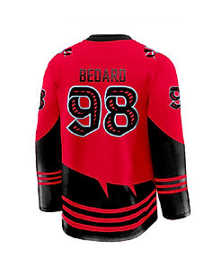
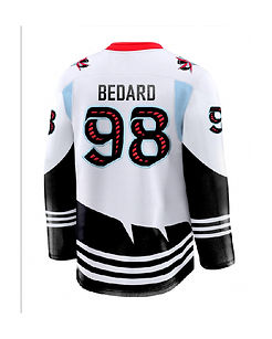
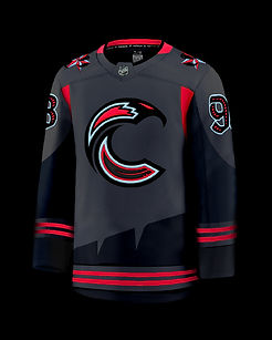
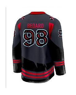
It is incumbent upon creatives to do what we can to positively affect culture with our tradecraft. Especially when a few thoughtful design decisions can help remedy a historically and presently problematic brand. It is my perspective that the Chicago Blackhawks could easily, and without sacrificing the team name, remedy the issue at hand by refocusing their branding on the black hawk (bird) instead of continuing to exploit the Sauk nation. The design work and concept in this post is mine, but is in no way sanctioned by the National Hockey League (NHL) or the Chicago Blackhawks.


My design concept was informed and inspired by the city flag of Chicago, its color palette and its four six-point stars, the black hawk (bird) and the inaugural/debut Chicago Blackhawks uniform worn when they joined the NHL in 1926.
The purpose behind the design however was the impetus of the project. I don't believe it was, is or ever will be right for professional sports teams to to appropriate Native American imagery in their branding. It minimizes the severity and consequence of the atrocious transgressions against the native nations, tribes and people by the U.S. Government and U.S. Army in the early days of this country's establishment.


People who call themselves Chicagoans and Chicago sports fans do not take their identity lightly. It was important to me to make a tight connection to Chicago and the black hawk (bird), so I chose to create the C with the form and elements of the team name's proposed new namesake and visual identity.


If an entire city of supporters is going to get behind a repositioning of their beloved hockey (or any pro sport) team's name, it better make them feel good and personally connected when they see it in action and on the apparel they buy to show their support, or there will be mass rejection. Just ask Chicago Fire (Major League Soccer (MLS)) supporters.
The Blackhawks have a long history of being a physically aggressive, fast and bombastic team. Their ethos is primarily what drove my design decisions in the styling of the C and its avian elements. I wanted it to have movement, ferocity and elegance. Like a giant hawk arcing high above the bending of the Earth before it stealthily picks off its prey miles below.
In addition to creating the team's primary mark/logo from the likeness of the bird, I integrated the black hawk's foot and talons with the city flag's six point star for the shoulder badge. I gave the star a two toned maritime look to it to make a gentle nod to the iconic Navy Pier and the city's freighting industry on Lake Michigan.
The styling of the player's number on the back borrows elements of the primary mark on the front. For example, the tops of the numbers take on the same shape as the hawk's beak and the bottom of the numbers are sheared off at the same angle as the bottom of the C.





Peloton x Denis Morton
Denis Morton was not made by Pfizer, you can't get the help of Astra Zeneca to pay for him and he doesn't have any nasty side effects. But he is a brand, and he does help people like me mitigate stress, anxiety and other emotional challenges throughout the course of my day with exercise. Cycling on Peloton to be specific.
As an expression of my gratitude for Denis and Peloton, I created a cycling apparel brand and line concept called "Morton Cycling Club".


Morton Cycling Club is inspired by Denis's particular proclivity to make exercise enjoyable by making it entertaining. Particularly by putting a picture in your head to mimic with your own pedal strokes or body movements. Like a lion stalking its prey on the Serengeti. It is his approach to fitness and aptitude to encourage effort that yields results without being demanding or intimidating that inspired the primary logo mark. And the lion thing. Definitely the lion thing.


The primary logo mark 'M' was modeled after the front legs of a lion stalking its prey on the Serengeti. It also bears a similarity to pedaling in a Peloton cycling class. It is imbued with strength, confidence and swagger. Feelings that are evoked by and throughout one of Denis's classes.


The accompanying type face and type treatment are intended to family well with the logo mark, but not compete with it for attention. It is a strong typeface with a lot of presence and its symmetrical qualities allow it to fit nicely into a variety of forms and spaces without too much fuss.
KIT DESIGNS
The kit designs echo the concept and themes found within the logo design and integrate elements from vintage Tour de France cycling kit designs. Instead of lifting patterns and design elements verbatim,
I put my Nike apparel design hat on and ingratiated the vintage elements with a contemporary sport look and feel.
The colors I chose were informed by Peloton's brand standards as well as the tank tops and shorts Denis wears during his classes.


KOHL'S
KOHL's has retained its burgundy colored Brutalist (to put it kindly) logo since 1987 despite its product offering and ambitious business decisions. My intention with this rebrand project was to help this nearly 100-year-old brand reflect its accomplishments internally and externally.


The design for the new logo was informed and inspired by research of the brands and celebrities KOHL'S has made the decision to partner with, changes they've made to their business model to reduce their carbon footprint and my observation of their consumer base when visiting/shopping over the years.


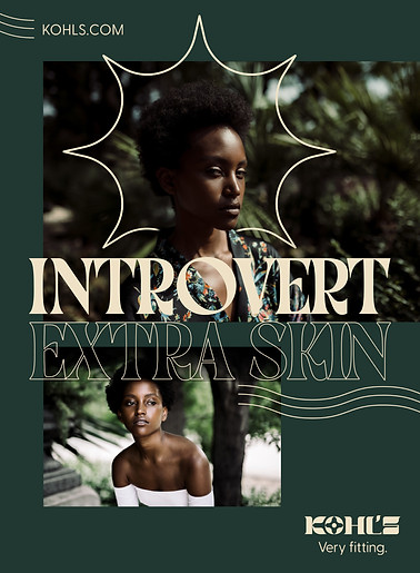
The final form the logo took is a blend of the masculine and the feminine, but leans more feminine like Kohl's consumer base does. It also integrates organic, plantlike shapes and lines to reflect the brand's green initiatives.


The characters use a combination of thick and thin line weights to create intrigue and balance. The thicker elements are inspired by leaf forms and are intended to look like they are sprouting off of their adjoined lines like leaves from a branch. The O resembles a flower with four pedals. The number of pedals correlates with the number of seasons as a nod to the brand's offerings that have their shoppers covered all year long. The O's shape and elements also resemble a proposed update to their retail locations' floor plan.
The overall intent of the design was to help elevate the brand aesthetically in the mind's eye of current and prospective brand loyalists. It is my view that a design like this would boost Kohl's presence to the same level as Sephora and Lady Gaga. This creates brand continuity and congruency for both brands and sets them up to partner with similar brands and celebs in the future.
The logo color options were inspired by two of Wisconsin's two most prized assets. The Green Bay Packers and the Milwaukee Bucks. The green is also a nice nod to the brand's green initiatives.

The look and feel of the brand's new presence and photography is inspired by the very human and relatable feeling of being connected. A oneness if you will. With nature and with each other. The feeling, as most people can agree, is elevated when we feel good in our own skin. Which, to some degree, can be elicited by wearing clothes we love. Fashion that reflects our sensibilities, our own nature, and our owns style. The graphic treatment and photography choices are intended to meet the level of elevation brought to the brand by the new logo.
The color palette/strategy is a two pronged approach.
If the ad or messaging is focused on brand awareness, or overarching brand messaging, the colors from the logo (green and taupe) will dominate.
If the ad or messaging is promoting seasonal wear or a seasonal sale, the layout will dominantly be the color I have aligned with each season (below).
PHOTOGRAPHY

COLOR

RETAIL PRESENCE
The proposed update to Kohl's retail location floor plan is a shopper-focused reaction to its current floor plan which was inspired by a racetrack. It is a floor plan that was created by discount retail brands and adopted by Kohl's in its early days.
To bring it up to speed with the branding concept I'm proposing, I drew inspiration from the city planning of Paris, France, which was designed for maximum efficiency during war time. Think of it as a rotating wheel with a central axle. The central axle in this case does not house a famous museum or government buildings, but the dressing rooms. Where all final decisions are made. The circular form of the store section and the strategically placed entrances and exits creates an efficient circular flow.
Easy in. Easy out.
Current layout

Proposed layout


Shopping bags reflect the new branding and design principles.


PRINT

SOCIAL


OUT OF HOME

CHEVROLET
Chevrolet's rise to fame was built on the backs of the American blue collar working class. It's the principal reason why its logo is an abstract bowtie. As Chevrolet enters the electric age, they are beginning to attract and become a meaningful brand to all socioeconomic classes on the national and global stage. They have not only shown the ambition to be a contributor to environmental preservation through engineering, but a competitive force in the design space as well with a refreshed design language. They are well on their way to being an automotive brand for collars and bowties of every color. And they need a badge and branding that reflects these ambitions.The branding concept below is my work, but has in no way been sanctioned or approved by Chevrolet or General Motors.


Founder, Louis Chevrolet


The proposed badge design and subsequent overall branding design is inspired by the brand's unrelenting racing and working class legacy as well as the brand's new automotive design language.


My redesign and updated stylization of the Chevrolet bowtie joins the past with the present and is intended to grow with the brand into the future. It is inspired by the original bowtie born created in 1913, clad in gold as it has been since 2002, borrows the sharper angles and thinner from the current design language's head/tail lights and has been modified into an infinity symbol to represent the brand's unrelenting forging of its own future and future of the American automotive industry.


The inspiration and intentionality behind the design of the new badge is echoed in the new brand identity, look and feel. The dimensionality and severe angles of the badge are echoed in the dark blue frame around the photography of the vehicles. The horizontal textured bars that fill the bowtie shape are indicative of the latest models' grill style as well as the stripes of the nation's flag.


The low profile proportions of the headline typeface and type design as well as its severe angles are also informed by the new badge design.The photography and supporting art direction choices are informed by the message in the new brand tag line, "Stray the course." A message that gives Chevrolet drivers the encouragement they're looking for to take their vehicle beyond the well trodden, familiar routes into ones that broaden their known world, take corners and straightaways at speeds they've only seen on TV and the internet and courses only the planet could carve upon itself. This is what will be seen in print, social, digital and TV. Chevrolet drivers in the throes of straying from their usual course.


Chevrolet has struck a similar chord with similarly minded people for generations. Resilience, power, speed and industriousness. As far as I've observed, it still does. But, with its full force behind a new design language and embrace of the electric age, it is primed to open itself up to a deeper, more diverse stable of drivers with different values, views, backgrounds and sensibilities. Chevrolet must stray from the path of least resistance without alienating its deeply rooted and passionate supporters. This balancing act is the tightrope I set out upon when I put words to the brand's new essence.


CHEVROLET BADGE KEY FOB
To further cement the new badge into Chevrolet's brand equity, I designed a minimalistic, metallic key fob that resembles the new badge.
When the key fob is swung all the way open (1), the car is unlocked.
When the key fob is swung closed (2-3), the car is locked.
1
2
3


Trunk release and panic alert button
located on side of key fob


